

3.26 Control Widget
The Control Widget allows a user to input a value via a dropdown, which then filters or updates connected widgets on the dashboard. Each Control Widget handles a single variable. For multiple variables under one submit button, see Control Group Widget.
Example: A user selects an airport from a dropdown and the connected table updates to show arrival and departure times for that airport.
To add the Control widget to your dashboard, drag and drop from the widget menu.
Setting up variables
Section titled “Setting up variables”Before configuring the widget, set up your variables in Variable Settings (see Variables section).
Once your variable is set up, select it from the variable dropdown in the widget settings.
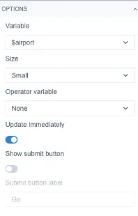
In the Format section you can configure the size, orientation, and alignment of the widget.
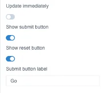
Update immediately – connected widgets update automatically as soon as a field is filled in.
Show submit button – connected widgets wait to update until the user presses the submit button.
Show reset button – allows the user to reset their inputs back to default values.
Submit button label – the submit button displays “Go” by default; this can be edited.
Connecting to a widget
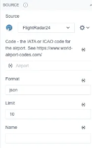
Section titled “Connecting to a widget”To connect the Control Widget to another widget on the dashboard, open that widget’s settings and click the (x) icon, then select the variable you configured.
Depending on the widget and its connected data source, there may be multiple settings that can be controlled by a variable.
See worked examples: Flight Information, Queue Times (using two Control Group widgets).